The History and Evolution of the Cadillac Logo

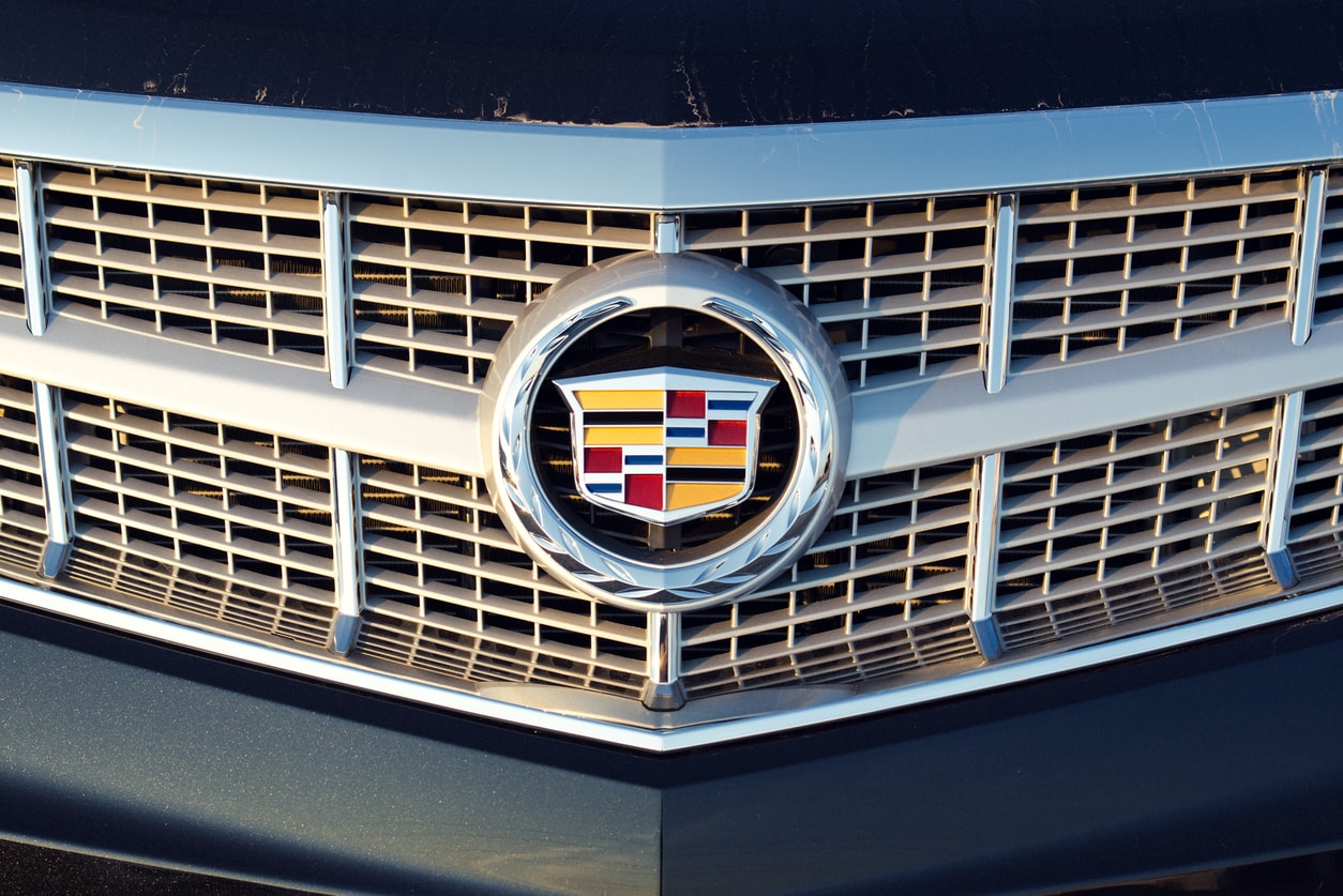
Any time the wreath and Crest of Cadillac appears, viewers know exactly what it means and what it stands for. The Cadillac symbol has long been associated with quality and luxury for those who want only the best when they invest in their vehicles. Learn more about its evolution over its lifetime to match the design and standards that Cadillac has continued to provide for many years.

Any time the wreath and Crest of Cadillac appears, viewers know exactly what it means and what it stands for. The Cadillac symbol has long been associated with quality and luxury for those who want only the best when they invest in their vehicles. The Cadillac symbol has evolved over its lifetime to match the design and standards that Cadillac has continued to provide for many years.
The Crest
While Cadillac experimented with several designs, in the beginning, the Cadillac crest has remained a part of the symbol even today. The Cadillac crest has a French lineage, as it is the coat of arms by an 18th-century adventurer, Antoine de la Mothe, Sieur de Cadillac. With his position in founding the city of Detroit and a family link to the Cadillac founder, Henry Leland, his inspiration lives on in what the Cadillac represents.
The Cadillac has gone through several designs over the years, but in most cases, it has been represented. Initially, the Crest has birds on each golden section of the Crest and was topped with a crown. Both the birds and the crown would stay a part of the Crest for over 80 years.
Early Symbols
Before Cadillac made it to the current Crest and wreath, several changes to the Cadillac symbol early on originated in 1902 with a wreath. Still, by the 1920s and several designs, the Crest was embedded in a tulip bulb wreath, a more dignified symbol at that time.
In the late 1940s, the Crest was paired with a V, representing the V8 engines in the Cadillac models. This V would be a part of the design through 1960, slowly widening the symbol and stretching the crest design.
Since 1963, the crest design has remained the same with minor changes throughout the years. Throughout the next 30 plus years, the Crest would continue to be central to the symbol and the circular wreath.
Making the Change
At the turn of the century in 1999, Cadillac decided to start a new century with an updated symbol as representation. Updated and chiseled, the new Crest removed both the birds and the crown from the design. It moved forward with sleek lines and a look that embellished a transitioning culture where elegance and technology came together in harmony.
The Colors
Despite the changing of the Cadillac crest, the gold and black have remained constant in the different symbols. They intended to represent royalty and later aristocracy, showcasing that the Cadillac is not to be confused with economy vehicles. This is illustrated with the black sitting against the gold, representing both wisdom and riches by Cadillac owners. It has and will continue to be the luxury brand for General Motors.
The Newest Logo
In 2014, the Cadillac logo was modernized again to represent cleaner lines in the Crest and embellish it as brand recognition among customers everywhere. The symbol has increased in size but is modern to match how the brand has changed and embraced technology in its vehicles. With a new class of customers and maintaining recognition with past Cadillac owners, it was essential to keep the same foundation of the design but improve the graphics.
Choose Cadillac For Your Next Purchase
For more information on the Cadillac line, you should speak to Cadillac experts who can give you more in-depth about the brand, what it represents, and how your quality of driving improves with a Cadillac purchase. Visit our Bradenton used car dealership at 4780 14th St. Monday - Saturday or give our sales team a call for more information (941) 932-8852. Now is the time to upgrade to top tier luxury and design.
